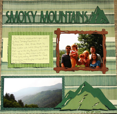
This is the first of my Tennessee vacation layouts (there will be more to come later as I get them done). Obviously, we went to the Smoky Mountains.
The background paper is from the Paper Studio 180 pack. The title, frame and mountains were all dome with my Cricut. I first drew the images with my Cricut markers (first time using those) and then cut them out. I used the Cricut Design Studio to plan my layout using the Camp out Solutions cartridge and Opposites Attract (upright) for the font. I'll be happy to share the cut files and directions with anyone who asks, just send me an email!
I did some hand journaling and then some more computer typed journaling (behind the journaling mat) on cardstock which I then matted on some leaf patterned card stock that I ran through my paper crimper. The mountain scape photo is mounted on some Bazill cardstock that I embossed with my Cuttlebug Swiss Dots folder and them enhanced with some Stazon opaque white ink.
Cuttlebug and Cricut items can be purchased from me via my store (I don't have the cartridges or Design Studio in stock ,but I can easily get them for you at a lower than retail price! Just email me.)


5 comments:
Ohhhhhh Kristina...this is breathtaking...you did the pictures proud....I love the color and cut choices...just wonderful!
It's spectacular. I love everything about it. I'd particularly like to be there away from the sweltering heat! You did a beautiful job.
Wow Kristina, I don't think you used the cricut too much, I think it's a fanastic lo...
OH WOW Kristina!!! I love this!! I don't have campout or I would soooo love to have the cut file!! AWESOME LO!!
This is really super Kristina, good job we don't do outdoors very well (unless it's by a pool!) otherwise you would have enabled me with this one.
hugs
En xx
Post a Comment